Taking introversion to a newer level than the level it was at before
So a couple of weeks ago I created a blog entry which described how I use TimeSnapper to preserve images of my desktop, and how I used an in-house script for creating little movies out of them.
I’ve gone back over these scripts and enhanced them so that there’s a bit of interactivity involved.
Here’s an animated version of what it looks like:
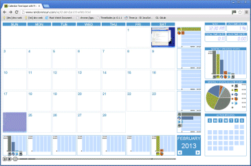
If you click on the screenshot above, you’ll be taken to a new page which shows the calendar video for February 2013. So much, so exciting.
But wait ! Underneath ! A slidey control ! Moving this thing forwards and backwards takes you through the month, and also updates the information panels underneath and to the right of the calendar video.
There are a few different sections on the page:
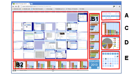
Timestamp (A): As the video progresses, it shows what is visible on the desktop at that time of day across the entire month. The time panel shows the current time of day of the calendar, together with the cumulative and average amount of time spent in front of the PC (from 12:00AM in the morning to the current time of day across the entire month), also expressed as a percentage.
Weekly statistics (B1/B2): There are sets of smaller graphs, section B2 that summarises each day of the week (Sunday to Saturday) and B1, which summarises each week of the month (1 through 4 or 5, depending on how many days are in the month and which day of the week the first day of the month was on).
These graphs show the top five applications for that day-of-the-week / week-of-the-month, together with the total time spent on the most popular application.
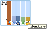
 ), about half an hour doing timesheets (
  ), and about the same amount of time on thunderbird (
  ), excel (
  )and rssbandit (
  ), an RSS news reader. The time in the top-left of the chart represents the total time spent using the most popular application (firefox) over all Mondays, which, since there are four Mondays in Febrary, comes out to about 27 minutes on average. Voila.
The chart shows all applications used from 12:00AM in the morning to the current time of day for that particular day-of-the-week or week-of-the-month, so it’s fun to watch it change as the day progresses.
Monthly statistics graph (C): The monthly stats graph is similar to the daily/weekly charts, but uses data across all days in the entire month.
Monthly statistics as a pie chart (D): Represents the same data as the monthly stats graph, but in a circle, with a slice carved out for the top four applications, and everything else lumped into an ‘everything else’ sector.
Currently active application (E): The current application panel shows the taskbar icon of the current application for each day of the week for the current time of day.
The play and stop buttons and the video slider at the bottom of the visualisation do what you’d expect them to do. You might notice that the progress bar is slightly brighter when there’s something happening at that particular time of the day.
So there you have it.
You would be surprised at how much time this took to put together, incidentally.
Eventually, each day in the visualisation will be clickable to allow the user to zoom into the activities that took place on that day (which I haven’t implemented yet, but currently brings up a dialog box), and the arrows in the bottom-right cell will take you to the previous and next month (also not implemented yet).
I’ve CDN’ed the video and the fairly bulky javascript behind it should be served via gzip, so hopefully the performance on your machine isn’t completely rubbish.
You could use this kind of application for other uses that need to summarise a lot of video data (e.g. security camera or webcam footage). If you’re American, perhaps you could hook it up to your Media Center and get a montage of the 34 hours of TV you watch on average per week. Contact me if you’re interested in using this visualisation in your own applications.
Postscript: