
Boxes and Lines
I thought I’d post up something about Graphviz, because if you haven’t used it, it really is a fantastically useful thing.
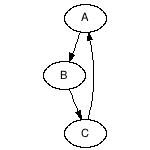
Graphviz takes text descriptions of relationships between objects and turns them into directed or undirected graphs, so for example you could give it some input like this:
digraph {
  A -> B;
  B -> C;
  C -> A;
}
and graphviz will take this description and convert it into this image:
Which may look simple enough but which is a horribly complicated thing to do even remotely well in practice.
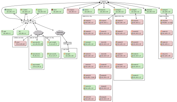
I use graphviz in vmaint to provide a visual respresentation of the status of the virtual machines for a developer, department, organisational unit or company[1]. Each coloured rectangle represents a physical or virtual machine, with the edges between rectangles express either ethernet, wifi or some kind of nebulous cloud-like connectivity between them.
A lot of developers use graphviz to show dependency information of modules within a software project to find out how the hell things have been structured, but other, normal people would find that too boring for words [2].
Those same people, however, may be interested in the usage of graphviz to provide some of the visualisations in fbbackup, a facebook backup app which I never got round to finishing. The example below shows an overview of “who knows who”: each node in the graph below is a user in the facebook hive mind, and a link between users means that they are mutual friends on facebook.
The chart below would normally display all users that are direct friends of whoever’s logged in at the time, but for the purposes of this blog entry, I’ve anonymised the profile icons with identicons, and generated some random names for the hoverCards. The chart can be colour-coded depending on various criteria; currently the colour of each node represents a different current location; e.g. a red blob indicates a user who has stated their current location as Brisbane.
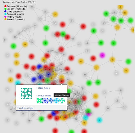
If you like, you can think of it as one of those thumbtacks-and-string wall charts that they always seem to have in police crime dramas where they try to work out the relationships between the different members of the Mafia. Except without the gang warfare, and with your friends instead. Well, possibly without the gang warfare. Depends on who your friends are.
Anyway, that will probably do for now. I’ll probably post up some code samples reasonably soon, perhaps reimplementing the graphviz subset of the Google Image Chart API, since the Gods of Google appear to have decided to deprecate it and it’s going to disappear sometime in 2015. Yay Google.
[2] where for the purpose of this sentence “words” are what you think a module name should be/are called. Try disassocating the meaning from them, that’s what I say, cursing incoherently whilst imperceptibly getting closer to whatever that sanity/insanity threshold is supposed to be.


