
Fisher Price Application Design
I was looking at doing up a mobile app back in around February this year after getting a shiny new phone, and started writing up a disjointed screed about user interfaces which I never published, but came across again when I revived that post about Bitrot. So anyway I thought I’d dust it off out of the ‘Drafts’ folder, throw in some screenshots, and post it up on the blog. This might therefore appear slightly out of date, so just imagine yourself living in February 2013. Round corners are so February.
Is it just me or does every app these days seem to be designed for two year olds ?
There seems to have been a gradual evolution to this point, which I’ll skip over for the most part but highlight some milestones that I think are relevant:
- In the beginning, we had secretaries and typewriters. Or monks and scrolls if you want to go back a little further. A lot of their time was spent copying things. We’ve certainly progressed since then.
- sometime after that, we got a desktop in every home
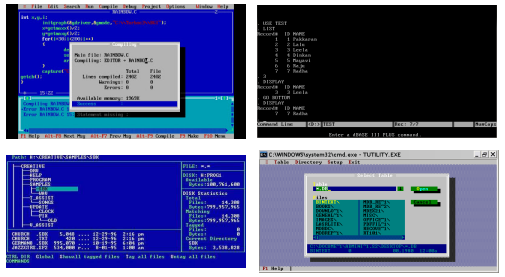
- remember the dim dark days of DOS ? Every program had it’s own interface, they were inconsistent, garish and generally horrible to use. Want to copy a file ? That’d be Ctrl-C. Or F2. Or F10. Or left square bracket, depending on which program happened to be open at the time.
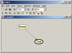
Then along came some GUIs which gained some market share, which attempted to enforce some guidelines on how to create interfaces that people might be able to discriminate from an 8-bit vortex of colour.
Like, you know, having a File menu somewhere vaguely up the top of the window / screen. (I was going to put in a link here to the old Windows/Apple user interface guidelines, but they don’t appear to exist any more).
But they generally seemed to think that having a similar set of menus splashed across all these programs would make it possible for people to easily use these new wonders of modern time saving.
For example, in looking for screenshots on Google Images, I came across this doozie from yesteryear. I have never used this program in my life, but I already know how to open, close and save a file, and most importantly, how to get rid of the bloody thing.
This seemed to work for a while
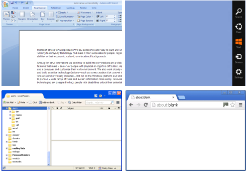
Then the companies who created these applications needed to make their now-rapidly-aging programs and/or operating systems look superficially different in order to make customers upgrade to the latest version, so we get ribbons and floating squares and whatnot.

These easy-to-use but slightly different interfaces makes the task of any IT person who has to assist people who don’t know which way a backslash goes in how to crank out the quarterly earnings report that much more joyful.
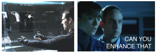
This is all, of course, just an interim measure until we reach our glorious Hollywood-inspired interfaces of the future, which will involve a lot of either wooshing or squiddly-beeping, depending on who’s playing with creative studio at the time.
But then came the web, giving people the ability once again to redefine what every user interface control should conceivably look like.
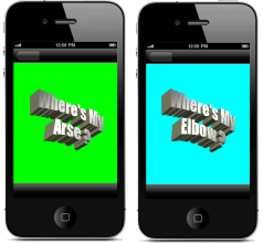
Because what we all need is another way of scrolling through a document.
That worked a treat for the web, so let’s put that in a phone …
– and so on
It’s not all bad
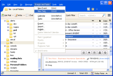
Anyway, just so there’s some kind of closure on this open-ended complaint, the only GUI I appear to actually like using has some kind of expandable tree control on the left hand side with a split larger section to the right showing more detail of whatever’s selected in the tree. And menus and a goddamn toolbar on the top. Which is the sort of thing you find popularised by email clients:
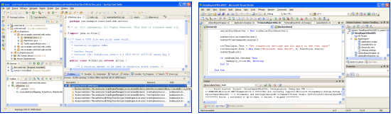
… and IDEs …
So if your program doesn’t look like that, then make it look like that.
Unless you want to be valued at a billion dollars. In which case, ignore everything I’ve said and just put four buttons on the thing.


